When it comes to home staging, there's really one golden rule: Make your space look bigger to would-be buyers. And perhaps nowhere is that concept more vitally important than in the living room—the place where homeowners tend to spend most of their time entertaining and relaxing, and where potential buyers will be placing extra scrutiny.
But you don't have to knock down walls or spend a small fortune to make things look big. Fortunately, there are a few quick and relatively affordable ways to maximize your living room's first impression, even when the square footage is lacking.
1. Don't leave your living room empty
"I have seen many buyers walk away from a vacant home because they falsely believe their own furniture will not fit in the master bedroom or that the living room will not provide enough seating for entertaining," she adds. "Staging rooms helps establish the room's size and helps a buyer visualize how they can arrange their own furniture."
But don't just shove some furniture in the living room and call it a day. There's actually a science to arranging your stuff in a way that makes the room feel bigger.
Most buyers scan a room from left to right upon entry, "just like the way we read," Barnett explains. If you place the tallest piece of furniture in the far left corner, the room will appear larger than if that same piece of furniture is closer to the entry. Placing a large or tall piece of furniture near an entryway or door tricks the eye into thinking a space is smaller than it is, so keep taller items in corners or eliminate them altogether.
2. Carefully consider your seating scheme
Choose
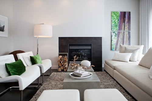
a focal point—a fireplace or windows with a view are the usual
suspects, but maybe yours is a great piece of art or a family
heirloom—and position your seating arrangement around it. And remember:
You want prospective buyers to imagine themselves actually living in and
using your space, so your seating concept should be functional.
“A well-staged room has a singular definable purpose and a focal point,” says interior designer Susan Anthony
of Susan Anthony Interiors. “The purpose of a living room is to
socialize, so the seating should encourage sitting and talking.”That means carefully considering how your room flows.
“You never want a buyer to walk into a room that's blocked or overloaded with heavy furniture,” says Caryn Benoit, co-owner of Nicole Jocelyn Staging & Design in Boston. “Make sure you’re not walking into the back of a large sofa, no chairs are in your way, and there aren’t other pieces of furniture in walking paths.”
3. Scale down your furniture
This should come as no surprise, but you never want to fill your small space with a truckload of huge stuff; you'll dwarf the space, naturally.
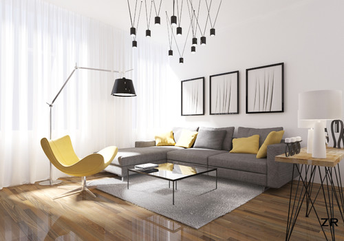
“Instead of a sectional or large sofa, use a love seat, a wedge sofa, or a semicircular sofa that curves inward,” says Michelle Ellis, owner of e-commerce retailer Cottage & Bungalow. “Using smaller furniture leaves more white space, which will make the room seem larger.”
Another alternative: Choose a piece that looks airy in a material like wicker or rattan (both of which are typically in high supply at retailers such as HomeGoods and Marshalls).
Beware, though, not to go overboard with the tiny pieces. Too many can make a room look cluttered and, therefore, smaller. Less is more here, folks.
4. Build around your largest piece—and edit ruthlessly
“Making the most of a small place can be difficult,” says Nicola Croughan, lead interior designer for Roman Blinds Direct. “You need to weigh up functionality with style.”
Her advice? Assess the room for your largest piece (likely your sofa), and judge every other item in the room against it.
“Think, ‘Does this serve a purpose, either functional or decorative?’” Croughan says. “If you can’t come up with an answer immediately, it’s not worth keeping.”
While you're at it, ditch bold, busy pieces of artwork for more neutral, unobtrusive prints, and get rid of the clunky family photos on the mantel. Remember: The goal is for your space—not your trinkets—to do the talking.
Pro stagers also nearly universally recommend ditching TV sets, which occupy a lot of visual real estate. The only exception? A wall-mounted, flat-screen TV that's appropriately sized to the room (that's the kicker).
5. Balance color
You don't need to slather your walls in an uninspiring, institution-evoking white. You can have some fun with it. But you'll need to follow some basic rules to avoid overwhelming the space.
First, and perhaps the most obvious, you'll want to nix dark or bold paint colors, which make cramped spaces feel tighter—or at least use them sparingly.
"You can definitely do an accent wall in a bolder color, but all four walls in navy blue will be oppressive," says Bee Heinemann, an interior design expert at Vant Wall Panels.
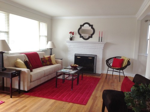
"Brighter colors need to be repeated to be balanced well—especially in a smaller space," adds Anthony. "If the rug is red and everything else in the room is various shades of neutral, add red to the pillows and accessories."
When it comes to ceiling colors, choose a shade that's lighter than your walls to give the impression of openness, Heinemann advises. And for extra credit, match your wall color to larger (lighter-hued) pieces of furniture, which Heinemann says makes the latter blend in and seem smaller.
6. Use the right materials
Avoid heavy bookshelves and try floating shelves instead (like these from Ikea). Then, embrace your inner Marie Kondo and declutter their contents by at least 60%.
7. Lighten up
An abundance of natural light tricks the eye into thinking a space is larger. To maximize light, keep your window treatments minimal with a simple roller shade, Croughan says.
If you must have curtains,
choose a lightweight, airy fabric such as voile or linen and mount the
rod as close to the ceiling as possible to create the illusion of
height. For darker rooms, hang mirrors to reflect the light you have.


No comments